Photography
Our photography style is key to our identity
Photography provides a visually impactful opportunity to showcase our expertise, and highlight the friendly and supportive community feel of QMU. Our photography should be real, believable and un-staged. Our use of supporting colours should convey: quality, heritage, expertise, dynamism and innovation.
Our photographic approach has been carefully chosen to best represent the University. In the guidelines that follow, photography is grouped by theme.
Above all, it is essential that photography is of professional quality, except in very particular circumstances. Professional photography helps sell the quality of the QMU experience.
The fundamentals:
QMU website, print and campaigns
- Clean, uncluttered photography to allow for placement of brand messaging in the form of print and web straplines.
- Landscape orientation, generally, but with some portrait orientation (note: main landing page banners are better as landscape, with portrait or small navigation thumb images).
- People-led shots, reflecting our people-led organisation.
- Blurred and selective focus on shots, almost as though one is seeing a glimpse into someone's world.
- Selling a lifestyle.
Social channels
- Portraits and 'people/student-led shots'.
- Showcase a real setting.
- Behind the scenes.
- Engaging.
- Opportunities for more relaxed style; less formal or corporate.
- Showcasing the scenery, setting and architecture.
- Believable / real shots - real people, interesting stories.
- No requirement for fully professional images in all cases.
Study here

Postgraduate
See samples below.

Campus life

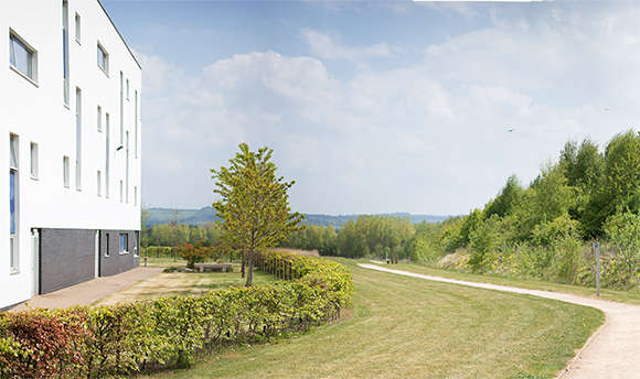
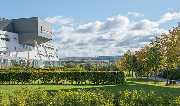
As shown in the samples here, colours should be vibrant to reflect the campus, but not garish or acidic. Employ clean shots. We recommend a Scandinavian type style to reflect the freshness of the architecture and buildings (but yet not so much that it becomes seen as a whim of fashion).
There are opportunities to showcase the environmental and sustainable ethos of QMU. Images should sell the lifestyle offered at QMU.
Classroom & facilities
(Technical; clinical; sports; labs)

As illustrated in the sample images shown, this area covers everything from research and knowledge exchange and laboratory shots, to sports and other equipment-focused shots.
Images and the colour palette for these areas should be cool, featuring icy colours to reflect the metal, equipment and strength.
There are opportunities to reflect more fun in the gym shots and extend this to shots of sports teams and classes.
General lecture shots

Show details of students (not whole class structure or lecture theatre).
Avoid direct head-on shots of lecture theatre students. Use selective soft focus. Consider different side angles. Minimise clutter. Note: there may be occasions where space shots are required for the theatres - in such scenarios, an option could be side angle shots taken from the back of the lecture theatre but looking down towards the lecturer. Shots should also focus on the student/s.
Black & white usage | Nostalgic

Left and right images by lensofhamish
Nostalgic/heritage shots may include everything from shots reflecting the history, heritage and roots of QMU, to shots to showcase the awards received and notable alumni.
Often black and white images may be used for such shots; in this case a white background is preferred.
Wildcard or creative images

While we have a preferred style and tone for photography for use on the website, prospectus and for flagship projects, there is room for wildcard or creative images. These would mostly be considered for press releases and our stakeholder magazine (QMYOU).
Other areas
Research and knowledge exchange
Clean, bright and modern. Show our expertise. Show a balance between lab-based and scientific research and more theoretical research (eg book, jackets).
Alumni and giving
The ultimate aim is to show the 'Community' and encourage engagement, and to give a sense alumni and friends are part of something. People are key to achieving this - conveyed through alumni shots and heritage imagery.
Business shots
Ultimately we need to show what it's like to work with QMU and that we can provide solutions for business problems.
Case study images are crucial and should not only focus on end products / deliverables, but also the steps towards the realisation of a business goal.
Images should show clients in their environment. Show the behind the scenes work of QMU to deliver for them. Show initial meetings, lab shots and then final deliverable shots or PR based shots. Show the whole journey.
About QMU
Campus shots (with and without people). Consider some shots across the pond looking over to QMU.
Community shots
Project based initiatives like the Children's University and the local community using the campus - dog walkers, families, Teen Gym and so on.
The accent colours should be informed by the photography; the photography should be informed by the subject area concerned; the type should be consistent.


